
Product Updates
New Quarterly Report Design!
We’re excited to announce that the quarterly board report has a brand-new design! We wanted to walk you through what’s changed and share a few tips for getting the most out of it, or watch the video below.
What’s new in the design
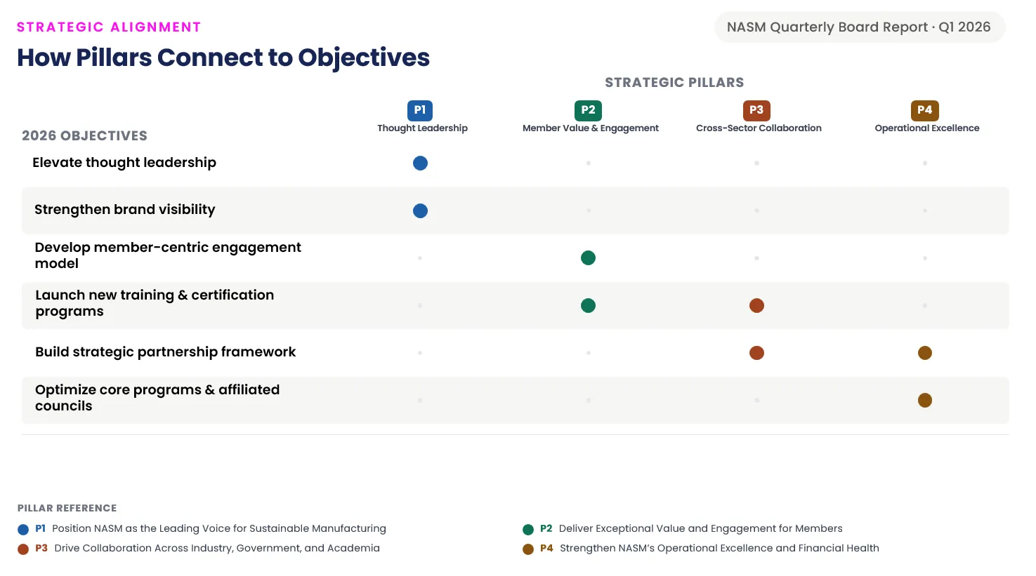
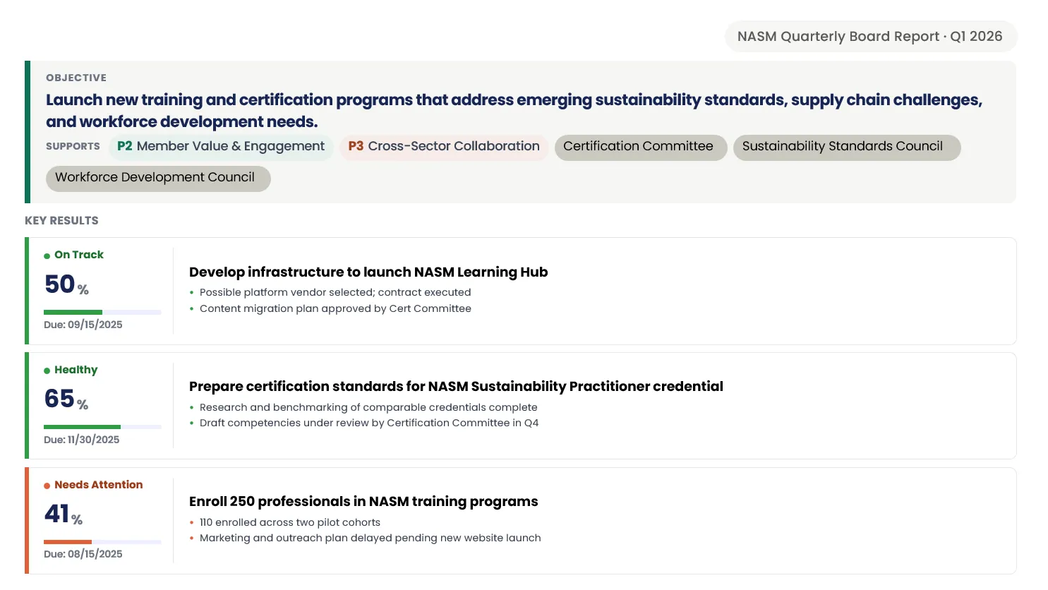
The report still has all the essentials you’re used to: your title, logo, mission and vision statements, your pillars and objectives and completion statuses, but in a cleaner more modern design. We’ve also redesigned how the report visually ties your objectives back to your pillars, so it’s easier to see how everything connects.
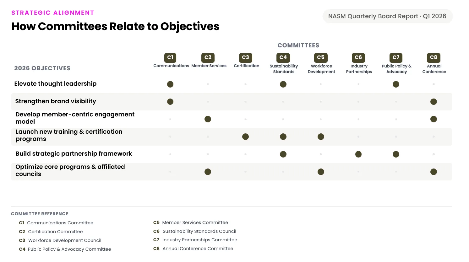
If you’re using custom relationships (a newer feature that lets you tag objectives with your own categories, like committees), those now show up linked to each objective too.
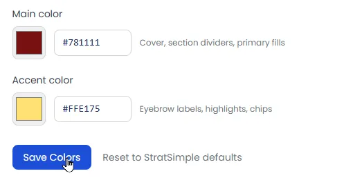
We now support custom colors, which appear on the section title slides and some headers, to match to your brand colors. If you reply with two of your brand’s hexadecimal colors (ie #172554), I can configure them now!
Video Demo
A few pointers for your reports
- Once you have reporting access, you’ll see a menu option to configure and run both your monthly email and your board report. Hit “Generate Report” and it’ll email to you right away and save to your report history, where you can always look back at them.
- You can run reports by team, by your pillars, or by custom relationships (like committees) — just let me know if you’d like help setting the last one up.
- Any goal left in draft status won’t appear in your report — so if a report looks emptier than expected, that might be why.
Want help setting any of this up?
Whether it’s custom relationships, connecting your pillars to objectives, brand colors, or anything else, please reply to this email or give us a call, and we’re happy to walk through it with you.